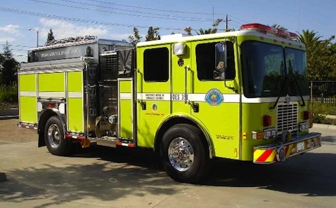
Should you ever wish to rile up a gathering of firefighters, to the point that punches may get thrown, bring up the notion that red is a dreadful color for fire engines. You can maximize your irritation factor by citing the work of one Dr. Stephen Solomon, an optometrist best known for proposing that fluorescent lime green is the best color for emergency vehicles. Such an eye-catching color, Solomon argued, forces even the laziest eye to pay attention, thereby minimizing collisions between ordinary vehicles and fire trucks or ambulances. Red, by contrast, just doesn’t slap around the oculars with enough force, especially late at night.
Solomon’s work helped nudge many fire departments across the nation to opt for lime-green engines during the 1970s and ’80s. But that trend may now be reversing itself, thanks in large part to a 2009 FEMA study that questioned whether visibility was as important as familiarity:
Whatever the specific color, research performed for this report suggests what is more important is the ability for drivers to recognize the vehicle for what it is. The use of a standardized color or paint scheme for certain types of vehicles may be helpful in this regard. An example is the ubiquitous “yellow school bus” prevalent throughout the United States. These vehicles are instantly recognizable and likely promote immediate behavioral responses by surrounding drivers. Similarly, U.S. Postal Service (USPS) or other mail/delivery trucks painted in a standard color may also prompt drivers to behave in certain ways (i.e., expecting multiple stops at any time). Following this principle, it is a common belief that people are more likely to identify red with a fire apparatus than other colors, regardless of the conditions.
In other words, because we all grew up learning that fire engines are red by definition, opting for another color scheme—however visually jarring—may not yield any better results than maintaining the status quo.
This has been music to many firefighters’ ears, as there has been widespread dissatisfaction with the lime-green trucks—not because they don’t work, but rather because many firefighters prefer the traditional red. It’s considered more macho and more elegant, and its backers have gone to great lengths to discredit the efficacy of lime green—some have even suggested (baselessly) that Dr. Solomon had a financial stake in a commercial lime-green pigment.
But is the switch being made too soon? The man behind the Ambulance Visibility Blog (yes, it exists) believes that red proponents have been too quick to interpret the FEMA study as a complete validation of their traditional choice. (Check out his take here.)
I’m struck by the lack of concrete evidence on either side of the debate. One thing that is clear, though: Those who embrace red do so largely for emotional reasons. Their professional identities are intricately linked to their jobs’ trademark color; to change that is to mess with who they are.


Jordan // Sep 16, 2010 at 1:22 pm
Well, as far as lime green goes, I know the jersey I got for Christmas has made me a lot more visible while biking: http://www.elevengear.com/trafficmaster.html
On the other hand, I thought there was fairly decent evidence that red on white tended to draw the eye, hence stop signs and the like. Maybe it would be better to just aim for more highly reflective paint, again á la traffic signs, to increase visibility.
Brendan I. Koerner // Sep 16, 2010 at 1:36 pm
@Jordan: Yes, reflective paint is mentioned in the FEMA study. But I still think there’s a big cultural element at play here–I can’t stop thinking how much American cops would bristle at the notion of mimicking their European counterparts by adopting Battenburg markings:
http://www.ukemergency.co.uk/police/yorkvo1.jpg
I’m just struck by the power of color and design, and how we’re trained to so closely identify certain core design choices with personal identity.
Brendan I. Koerner // Sep 16, 2010 at 1:37 pm
@Jordan: Also, yes, that is a intensely visible biking jersey. Not just the color, but the pattern.
Davis X. Machina // Sep 16, 2010 at 2:09 pm
50 years ago, unbidden by any federal or state agency, Quincy, MA had white fire trucks.
Brendan I. Koerner // Sep 16, 2010 at 2:29 pm
Though it looks like they bowed to peer pressure at some point and opted for red:
http://www.massfiretrucks.com/Quincy_Engine_3_2007.jpg
ADW // Sep 16, 2010 at 3:07 pm
I’ll cop to having a purely emotional, illogical attachment to the red fire truck. It may be more recognizable, though I’m not sure I believe that, but lime green is just wrong. Imagine if stop signs were suddenly changed to lime green, or something else that has always been a certain way – it’s a blow to the heart.
Brendan I. Koerner // Sep 16, 2010 at 3:27 pm
@ADW: Agreed, it seems wrong, given that we all grew up reading kiddies books about red fire engines. But what if further research proves that lime green does, indeed, reduce accidents? As I note in the post, the evidence isn’t there yet, and there probably is some cultural overlay that means that certain colors will work better in some countries than others. But if the final scientific word is that lime green is the way to go, can we all stomach the switch in the name of safety?
Also, I really shouldn’t be writing this comment, but my flight home is delayed. You’re bringing me down, JetBlue…
Jordan // Sep 16, 2010 at 3:30 pm
Yeah, tradition does play a big part. I’m still getting used to the fact that police cars are transitioning away from the old Crown Vics. Those had such a recognizable shape and now you never know what they’re going to be in.
And yes, I think the “listerine-for-the-eyes” description is pretty apt. I get some funny looks when I wear it, but it’s comforting to know that yes, people will see me at night. Even if they’re half blind.
ADW // Sep 16, 2010 at 6:27 pm
@BK: I suppose I could tolerate the change if it saved lives. Like I said, it’s purely emotional. And, then there’s the association of red with fire. I just can’t imagine reading, “The Little Lime Green Engine” to my grandkids – doesn’t have the same umph.
Also, there’s location to consider. I grew up in the Oakland Hills – the forest, as my daughter calls it – and residents live under the threat of a dangerous wild fire. Shades of yellow to deep green. I don’t know that lime green would work there. It would blend right in.
@Jordan
I associate those neon yellow/green vests with highway workers (CalTrans and prisoners – working the road – wears them), so I immediately slow down. The vests build on an already established link. Plus, yellow symbolizes caution. No biker should be riding at night without one.
Ell // Sep 20, 2010 at 10:17 am
Forget the truck – men in red get noticed.
http://blogs.plos.org/blog/2010/09/17/i%E2%80%99m-not-only-the-red-club-president-i%E2%80%99m-a-client/
I have wondered what will happen when everyone takes to wearing safety colours as seems to be happening here – will we stop “seeing”?